Category Archives: Web Design
A Four Point Guide to Choosing the Perfect Image
By Tomahawk on
Images can make or break a brand. As much as a good design is important for marketing materials nothing can replace the impact of an engaging image. Images add realism and authenticity to your product. But often just realism is not enough. The images must be engaging enough to prompt the intended response from your audience. Here are a few pointers to help choose the right images.
Power

Powerful images are those that capture your audience and create an imprint in their memory. Images are like teasers. We want a user to be so impressed by an image that they are tempted to experience your product or service themselves. Lighting, depth of field, proportion, layout, dynamism, actions, expressions and many such elements determine the impact of a photograph. Hire a good...
Decoding Your Logo
By Tomahawk on

Your logo is the face of your company. It creates a first impression and can greatly impact how your brand is perceived. You will use it everywhere, from your business cards and website to your signage and may even extend your company car! So of course, you really need to get it right.
Bespoke
The first and foremost essential for a good logo, is that it should be bespoke. It should be custom designed by an expert, in line with the company’s vision and appeal not only to you but to your target audience.
Relevance
Secondly it should be relevant to your product and industry. Relevance does not mean using generic industry icons – the Mercedes logo is not a car, the McDonalds logo is not a burger. It needs to be visually unique so it stands out in a crowd. There is a lot...
Write the Right Way - Typography
By Pallavi Karambelkar on
While imagery and design dominate the overall look and feel of a website, there is no denying the fact that more than 50% of any average business website is words. At the end of the day, your customer is browsing your website to gain information about your product, not just look at pretty pictures. It is therefore crucial to devote a lot of careful thought and deliberation to getting typography right on your website.
Choose the right type

Finding the ideal font to pair with your brand can be challenging. There is a plethora of good typefaces out there, but which is that one combination that fits your needs perfectly?
There are multiple styles to choose from such as Serif, Sans serif, handwritten, cursive script, decorative or different weights like Regular, Bold, Italic,...
The Vocabulary of Colour
By Pallavi Karambelkar on
Colour is a powerful design tool. It influences the overall look and feel of your website and makes the first impression on your potential customer’s mind. Colour creates atmosphere, the vibe of your website and changes how a customer feels about your business. It is important to understand the vocabulary of colour to create a design that is pleasing to the eye and connects your brand to your audience.
Colour Jargon
Color theory is the interaction of colors in a design through complementation, contrast, and vibrancy. The colour wheel helps identify categories such as primary, secondary and tertiary colours and colour schemes like complementary, analogous and monochrome. When used appropriately these color combinations are foolproof and harmonious. Including shades or tints of the...
5 Surefire Ways to Increase Year-Round Bookings
By Gina Paladini on

Perhaps you have plenty of bookings during the high season, but what can you do to ensure bookings flow all year, through shoulder and low season? Here are five proven tactics that will keep your bookings rolling in every season.
1. Responsive site

To ensure year-round bookings, first you must get the basics right. According to eMarketer’s latest estimates of travel research in 2016, 51.8% of all travellers who book trips online will do so using a mobile device.
That means your accommodation, whether you’re a small two-room B&B or a large resort, must have a responsive website site that can be viewed on any size device.
2. Powerful Booking Engine
Another fundamental key to increasing your online booking lies in the system you use – namely, your booking...
10 Golden Rules of Web Design
By Pallavi Karambelkar on
Usability, visual design and functionality are the three key elements that determine the success or failure of a website. It’s not just about making the website look pretty - use design to effectively guide a user through a path and make an impression of your brand upon the customer.
1. Space
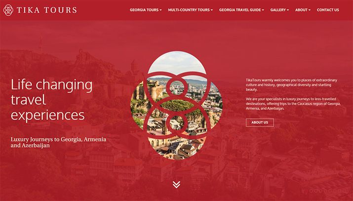
Our website for Tika Tours is a great example of how space can be used effectively to direct a users focus on important elements.

Space is one of the most important elements of design because it dictates everything from flow to readability to colours and layout. Every design needs space to breathe. For example, a user would never see your ‘Book Now’ button if it was cluttered with 10 other elements around it.
2. Layout
Our website for Touch of Spice shows how a consistent grid...
