Author Archives: Pallavi Karambelkar
ABOUT THE AUTHOR
Pallavi Karambelkar | Creative Lead
Write the Right Way - Typography
By Pallavi Karambelkar on
While imagery and design dominate the overall look and feel of a website, there is no denying the fact that more than 50% of any average business website is words. At the end of the day, your customer is browsing your website to gain information about your product, not just look at pretty pictures. It is therefore crucial to devote a lot of careful thought and deliberation to getting typography right on your website.
Choose the right type

Finding the ideal font to pair with your brand can be challenging. There is a plethora of good typefaces out there, but which is that one combination that fits your needs perfectly?
There are multiple styles to choose from such as Serif, Sans serif, handwritten, cursive script, decorative or different weights like Regular, Bold, Italic,...
The Vocabulary of Colour
By Pallavi Karambelkar on
Colour is a powerful design tool. It influences the overall look and feel of your website and makes the first impression on your potential customer’s mind. Colour creates atmosphere, the vibe of your website and changes how a customer feels about your business. It is important to understand the vocabulary of colour to create a design that is pleasing to the eye and connects your brand to your audience.
Colour Jargon
Color theory is the interaction of colors in a design through complementation, contrast, and vibrancy. The colour wheel helps identify categories such as primary, secondary and tertiary colours and colour schemes like complementary, analogous and monochrome. When used appropriately these color combinations are foolproof and harmonious. Including shades or tints of the...
10 Golden Rules of Web Design
By Pallavi Karambelkar on
Usability, visual design and functionality are the three key elements that determine the success or failure of a website. It’s not just about making the website look pretty - use design to effectively guide a user through a path and make an impression of your brand upon the customer.
1. Space
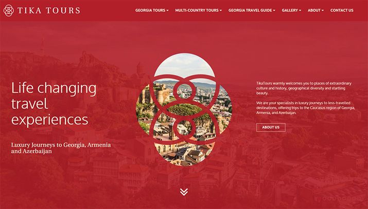
Our website for Tika Tours is a great example of how space can be used effectively to direct a users focus on important elements.

Space is one of the most important elements of design because it dictates everything from flow to readability to colours and layout. Every design needs space to breathe. For example, a user would never see your ‘Book Now’ button if it was cluttered with 10 other elements around it.
2. Layout
Our website for Touch of Spice shows how a consistent grid...
