10 Golden Rules of Web Design
By Pallavi Karambelkar on
Usability, visual design and functionality are the three key elements that determine the success or failure of a website. It’s not just about making the website look pretty - use design to effectively guide a user through a path and make an impression of your brand upon the customer.
1. Space
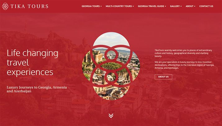
Our website for Tika Tours is a great example of how space can be used effectively to direct a users focus on important elements.

Space is one of the most important elements of design because it dictates everything from flow to readability to colours and layout. Every design needs space to breathe. For example, a user would never see your ‘Book Now’ button if it was cluttered with 10 other elements around it.
2. Layout
Our website for Touch of Spice shows how a consistent grid layout creates a balanced design.

A good layout is one that is balanced. This does not always mean that the layout must be symmetrical. What it means is that every element should be positioned keeping in mind its ‘visual weight’ and the effect it has on surrounding elements. The overall design must follow through a consistent grid. This helps create that balance and avoid making the overall design lopsided.
3. Navigation
The Visit Solomons website shows a small menu list enhanced by the use of a dropdown mega menu whereas the Paradise Motorcycles menu showcases the division of primary and secondary menu items.


The design of a navigation menu is very subjective and greatly depends on the number of menu items. Keep the number of navigation items to a minimum so you don’t overwhelm the users. Sometimes in complex websites a lot of navigation items may be unavoidable. In these cases the design needs to bring in hierarchy. This may be done through various ways like introducing mega menus or dividing the menu into primary and secondary components, or moving some menu items to the footer section.
4. Calls to Action
The Audobon Limousine website is a good example of highlighting a call to action with the use of color.

Every website is a gateway to a specific action that we want to direct the user to, like a call to action to make a sale or provide contact information. Some examples include the ‘Book Now’ button, the ‘Send enquiry’ button, the ‘Subscribe to Newsletter’ button, the ‘Get in Touch’ button. To ensure the user’s attention, these calls to action must be obvious and strong. This is done through design with the use of colour, contrast, size, space and placement.
5. Images and Video
The Annandale website showcases a great combination of stunning images and video and a beautiful functional design.

Images and videos bring action and realism to your website. They talk to your customer without depending on long paragraphs of text. Use real photos of your offering with real people. Humans make connections with humans and an emotive image of a person enjoying your product/offering is more likely to attract a website user’s attention than just a static photo involving no action. With advancing technology screen sizes almost increasing by the minute, the quality of the images has now become more important than ever. While you may look at your website on a 14 inch laptop in your office and love the images, they may be disappointing a potential customer out there who sees pixilated (grainy) images on a 27 inch screen.
6. Colour
​Release Wanaka is a great example of a colour scheme developed to complement with a single colour logo and multi-coloured images.
​
The colours chosen for your website must not only be ‘nice’ but also right for your offering. The overall colour scheme must be pleasing to the eye, tie in with your logo, reflect the emotions of your brand, complement the images used on the website and create contrast as required by the content.
7. Typography
Touch of Spice and Duke of Marlborough showcase the role of a typeface in depicting an overall impression of a brand and creating hierarchy.


Every font has a personality and choosing the right one can make a huge difference to how your brand/website is perceived. While the visual aspect matters we must not forget that the primary goal of words is that they must be easy to read. Every font has its advantages and limitations. Identifying those and using the right font in the right place is important. Some fonts are serious while some others are playful. Some work well only for titles in big sizes and some work better if used for big chunks of paragraph text. Colour and contrast play an important role here as well. For example, pure white text on a pure black background is very difficult to read, but just by making subtle changes to both colours, that is, light grey text on a dark grey background is very soft and pleasing to the eye and has much better legibility.
8. Motion
Visit Solomons is a wonderful example of motion entwined with images to create a stunning website.

The primary advantage of a website over to a static printed brochure is that it is dynamic and interactive. This doesn’t mean some tacky animation making the leaves in a photo move or a frog jump out on the screen. It can be achieved through some simple and subtle mouse hover effects that subtly communicate the action of a element or page to a user. It includes things like changing a button colour, adding an outline or a subtle motion on a photo on mouse over.
9. Consistency
The Christchurch Holiday Home website showcases how different pages through the website can be made consistent with design in spite of distinctly different content.


Visual consistency can make or break a design. Consistency builds trust. It is important that a user feels familiar throughout navigating every page of the website. Google research found that simpler, familiar websites persuaded users to stay. Drastically different layouts, colours, typography, icons, etc. between different pages can create a jarring, unsettling effect. The last thing you want is a potential customer clicking on an internal page in your website and losing trust because the page looks entirely different and does not connect with the visual language of your business.
10. Text
The Stoneridge Estate website displays how optimum text can help balance a design.

A good website design will fail if it is loaded with heavy chunks of text. It is important to provide the user with necessary information without beating around the bush. Designing the text appropriately through text size and weight (regular/bold/italic) can help bring in hierarchy.
These may sound complicated, but with a strong designer to guide you, your website will be a powerful visual tool to promote your brand and increase bookings.
Find out more about Tomahawk's web design services.
ABOUT THE AUTHOR
Pallavi Karambelkar | Creative Lead
Read more articles
Tonga launches new destination brand: The Friendly Islands
By Tomahawk |

The Kingdom of Tonga has unveiled its new destination brand, “Kingdom of Tonga: The Friendly Islands”, developed in partnership with Tomahawk.
Drawing on Tonga’s globally recognised nickname, The Friendly Islands, the new brand...
The Evolution of Content
By Tomahawk |

If you're a tourism business trying to stand out online today, you’ve likely felt the challenge of producing content that actually gets noticed. The right content done well will help to drive visibility, trust, and engagement across...
