The Client
Over The Top is a leading luxury helicopter scenic and charter flight operator based in Queenstown. Their strong brand presence in the market and innovation in the scenic flight sector provides a credible platform for attracting clients and bookings.
As such, it’s important for them to have an online presence that reflects their brand and showcases the experiences they offer.
The Opportunity
To enhance their profile in 2019, Over The Top invested in a new bespoke website that was highly emotive with stunning imagery and a dramatic design. They recognise that their key asset to drive direct bookings is their website, and it needs to be reviewed to ensure it maintains the best standards in usability. In 2024, through a UX audit, it was identified that areas of their website needed to be enhanced to meet today's customer expectations.
The Solution
The team at Tomahawk recommended a UX audit to identify where their website could be improved to guide the customer journey through the booking process. Key improvements applied included:
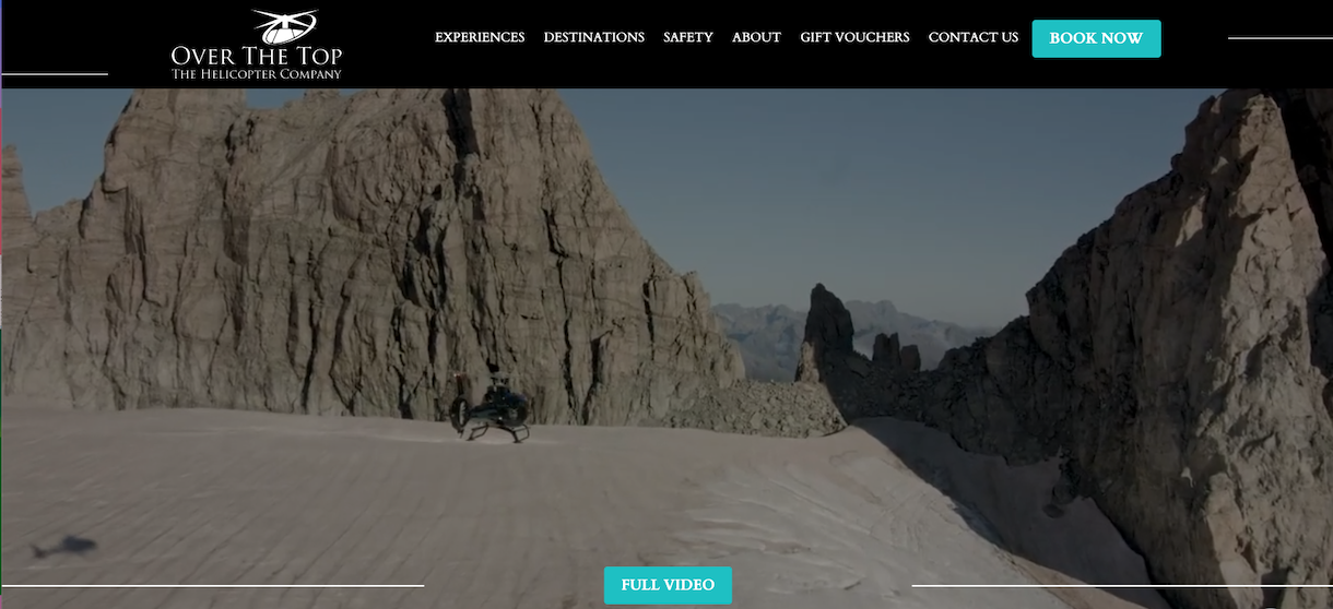
- Refinement of the home page content and general layout to better feature their service and pedigree. A feature brand video was added to the main banner to draw users into what they can experience.
- The top navigation menu was reworked for better clarity and site structure. The menu was fixed to the top of the page for easy access.
- Refinement of the ‘Experiences’ page layout into a grid format to view all the experiences on offer with a simplified filter selection for ease of finding suitable experiences.
- Updated the ‘Destinations’ page to include a map of their operational area and new destination detailed pages which also improves SEO visibility.
- Refinement of the website's mobile experience to improve navigation and access to the main Book Now CTA.
The Results
After applying the UX changes to flynz.co.nz the following notable results were achieved:
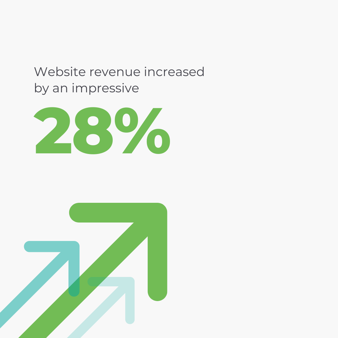
- Website revenue increased by an impressive 28% compared to the same month the previous year. This will continue to provide returns as the business moves into peak season.
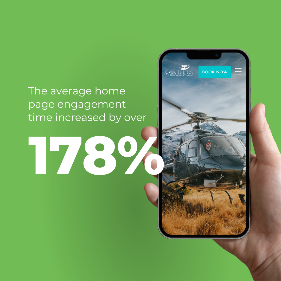
- The average home page engagement time increased by an outstanding 178%. Homepage views, views per user, engagement time and revenue all increased.
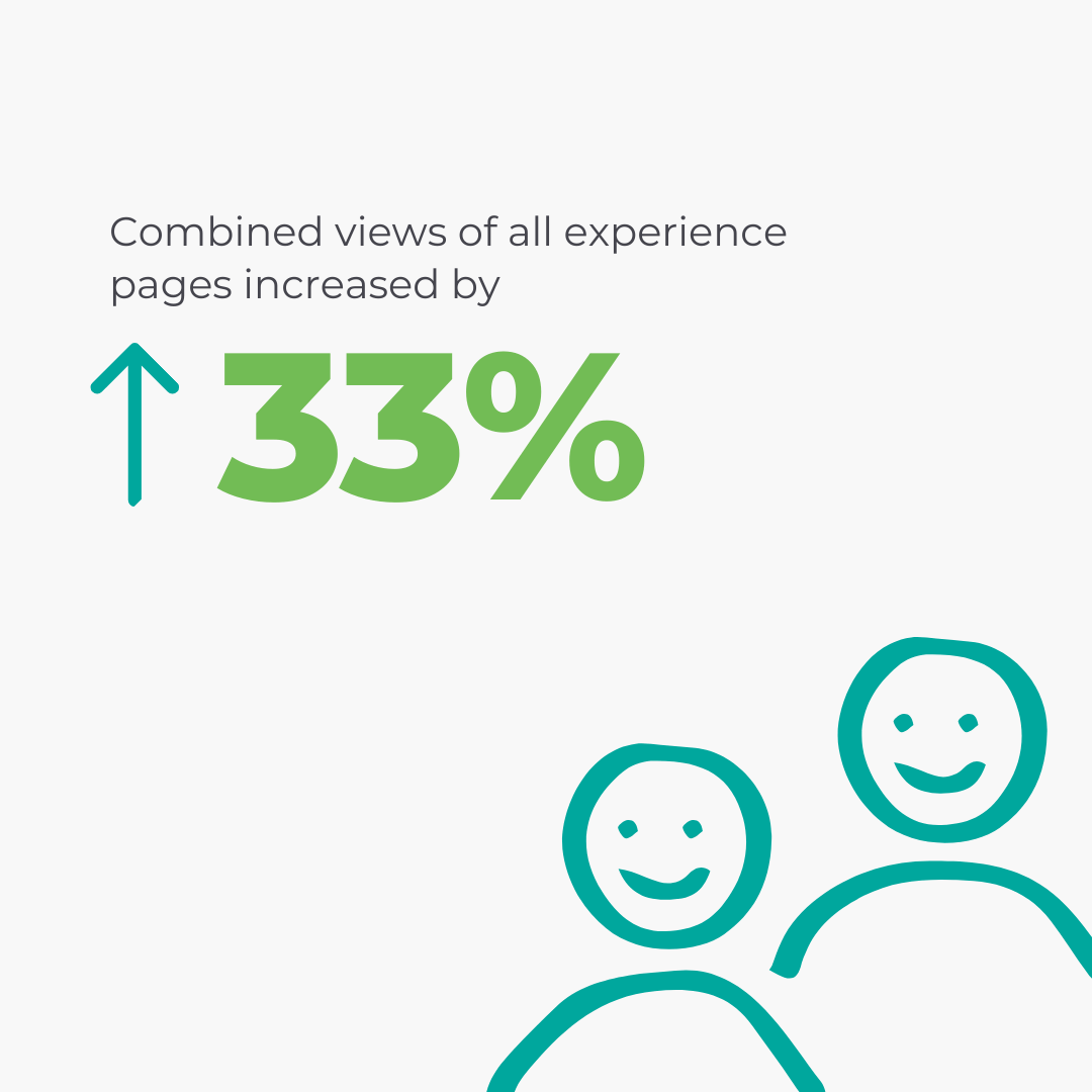
- Combined views of all ‘Experiences’ pages increased by 33% and users increased by 41%.
These incredible results highlight the value of conducting a user experience audit to identify opportunities for improvements. The impact on booking conversions, revenue and engagement can be quite significant.
It’s recommended to continually evaluate your website performance and look for UX improvements. Alternatively, if it’s been a few years since your website was refreshed, talk to the Tomahawk team about a new website.
